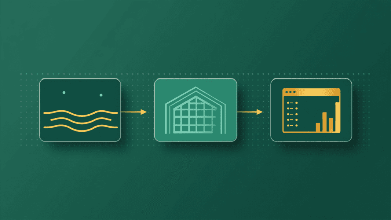
Before Power BI comes the foundation: why dashboards fail when data is a mess
Many companies buy BI hoping it will fix their data problem — and find that the chart just made the mess more visible. The foundation comes before the dashboard.

The journey often starts at the end. A company signs up for Power BI, Looker Studio or Tableau, hoping to finally see its numbers clearly. It pays for licenses, sometimes for a consultant, and a few weeks later the dashboard is there — beautiful, colorful and... ignored. People go back to checking numbers in the same old spreadsheet. The reason is almost never the BI tool. It's the data feeding it.
A dashboard only shows what it's given
BI tools are excellent at what they do: presenting data clearly and interactively. But they don't fix duplicate data, they don't reconcile a customer spelled three different ways, they don't recover history trapped in an old system, and they don't decide which source is right when two disagree. If the input is a mess, the output is pretty and wrong — and a wrong number that looks professional is worse than no dashboard at all, because it drives confident decisions in the wrong direction.
Why the dashboard fails in practice
- Each source has its own format and rules;
- The same fields have different names in each system;
- There are duplicates and inconsistent records nobody has cleaned up;
- There's no layer that standardizes and cleans data before it's displayed;
- The dashboard connects straight to spreadsheets and exports that change all the time.
The order that works
The right sequence is the opposite of starting with BI. First, centralize your sources in one place. Then clean and standardize the data — this is where the layers come in: Bronze (raw data, as it arrived), Silver (clean, standardized data) and Gold (modeled data, ready for analysis). Only then connect the BI tool, pointing it at the Gold layer. The dashboard now reflects a reliable, stable foundation instead of a patchwork that changes with every export.
This order also solves a quiet problem: performance. Slow dashboards are almost always a symptom of poorly prepared data — the tool tries to process on the fly what should already be ready. Delivering modeled tables makes dashboards load fast.
A practical example
A retail chain wanted a simple sales-by-region dashboard. The first version showed totals that didn't match finance, because it pulled straight from each store's exports — each one spelling region names its own way and using different date formats. After centralizing sales, standardizing regions and dates and consolidating everything in a cleaned layer, the same dashboard matched finance. It stopped being a source of arguments and became a basis for decisions.
The dashboard still matters
None of this diminishes the value of BI — quite the opposite. Power BI, Looker Studio and Tableau are great tools; they just deliver on their promise only when they get a solid foundation. Investing in the foundation first is what makes the BI investment pay off.
It's worth noting that the right order doesn't force you to use two tools. ingestia.io now has native BI built into the platform — dashboards with dozens of visuals, centralized measures, row-level access control and AI that answers questions in plain language — reading directly from the cleaned layers. If your company already uses Power BI, keep using it: the prepared data serves both paths. The point of this article holds either way: foundation first, then the dashboard.
How a platform like ingestia.io helps
ingestia.io takes care of that foundation before BI: it connects your sources, builds the Bronze, Silver and Gold layers and delivers ready-to-use tables to Power BI, Looker Studio and Tableau over a read-only connection — or dashboards in the platform's own native BI, with AI included. Whatever the tool, your dashboards run on reliable, stable data, with no export workarounds behind them.
The goal is to deliver the complete platform for moving past scattered data: connect sources, organize them into Bronze, Silver and Gold layers, transform with a wizard or SQL, and use the data wherever it makes sense — in the native BI (with dashboards, measures and alerts), by asking the AI in plain language, in AI Analyst reports, or through APIs, webhooks and external tools like Power BI and Excel. All on a monthly plan with usage credits, consumption tracked in real time — and no data team required to get started.
Keep reading
Pages that go deeper into what you just read.
Does your company need to centralize data?
Take the ingestia.io Data Structure Simulator and find out which path makes the most sense to organize your sources, cut rework and build a reliable foundation for reports, dashboards and integrations.